
Reccy is an image recognition technology app that uses Artificial Intelligence and Augmented Reality to facilitate the recycling process and help users quickly and accurately, sort and dispose of their rubbish.
- Time Frame: 13 weeks (2019)
- Role: User Research, UX/UI Design, Interaction Design, User Testing
- Tools: Figma, Miro, Adobe Photoshop, Adobe Illustrator, Adobe After Effects, Adobe Premiere Pro
- Team: Anthony Yip, Natalie Loyzaga, Maya Okada-Zalewski
Concept Video
Project Brief
To investigate and improve the waste management of residents in Sydney, discovering any common misconceptions and understanding the status quo of the sector.
Research Overview
According to the NSW Local Government Waste and Resource Recovery Data Report 2014–15 NSW had produced 3.69 million tons of domestic waste (2.13 million tonnes of residual waste and 1.56 million tonnes of dry recycling and organics) with its number steadily increasing. With waste being produced every day of every year, recycling is a highly important system to help reduce the waste produced. Under these circumstances it is important that Australian citizens are provided the proper assistance and opportunities to properly dispose their rubbish. From our combined research on this problem area we discovered that people's lack of commitment to sustainability and recycling is mainly due to apathy and inconvenience, as well as a lack of understanding of what types of materials are recyclable. According to a poll by Ipsos in 2011, main reasons respondent cited for not recycling are: it is not accesisble or convenient to where they live; it is too time consuming, they forget, or they are confused as to what is recyclable ("The Psychology Behind Why People Don't Recycle", 2019).
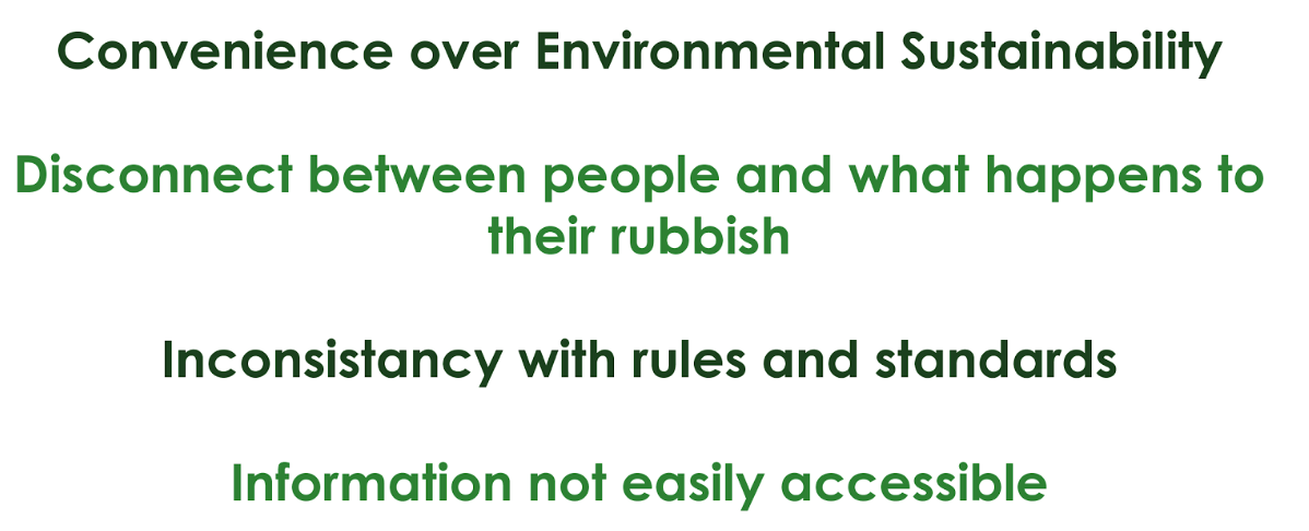
Problem Themes
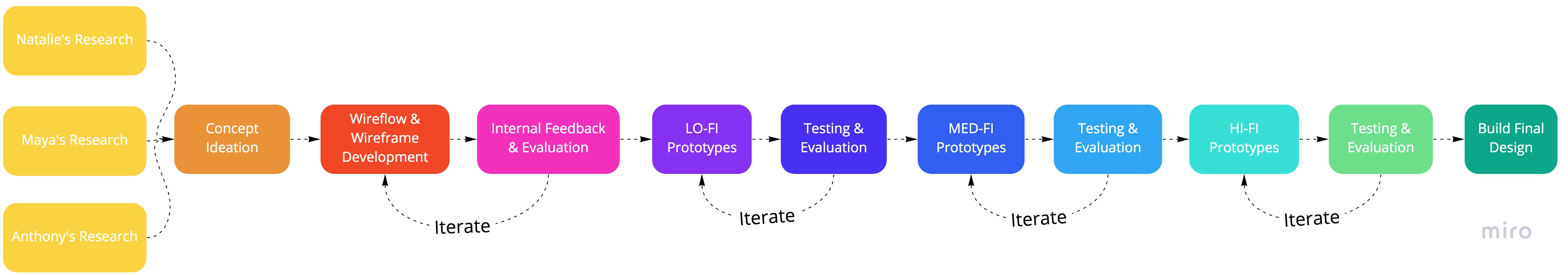
Process Overview
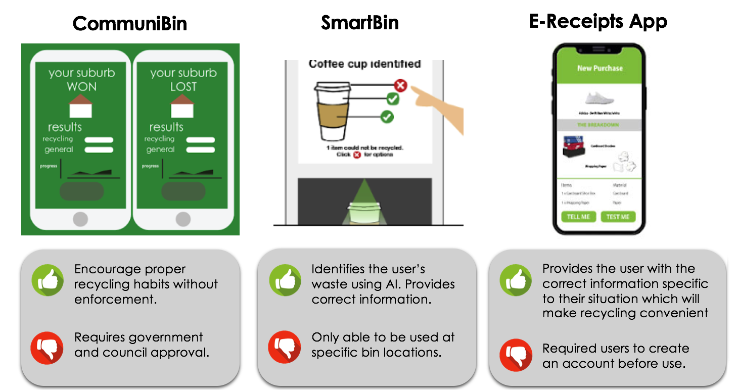
Our Initial 3 Concepts
Final Concept
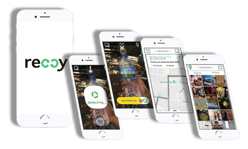
We combined our Smart Bin and E-reciept App to create a mobile Application concept that will provide users with the necessary information to recycle.
Design Overview
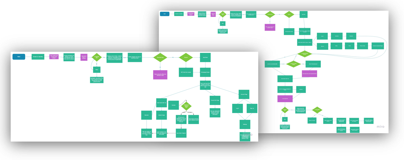
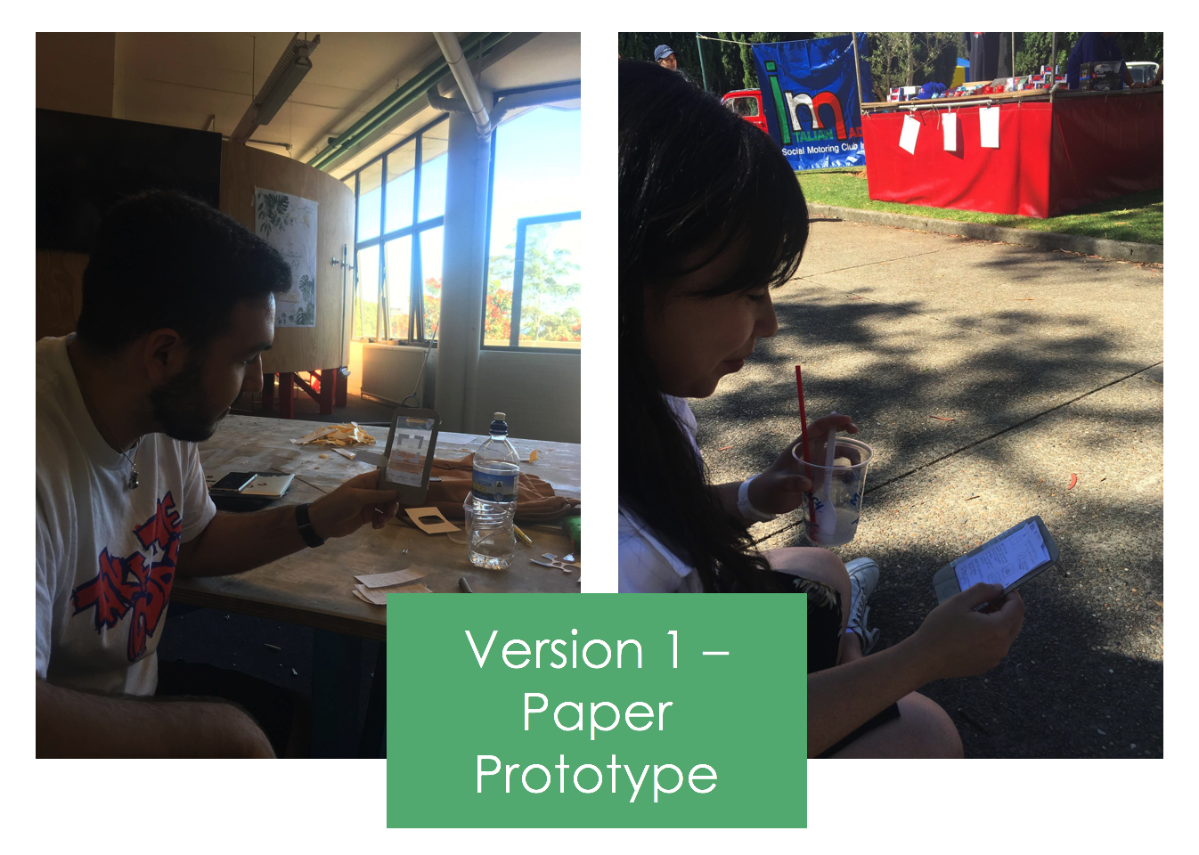
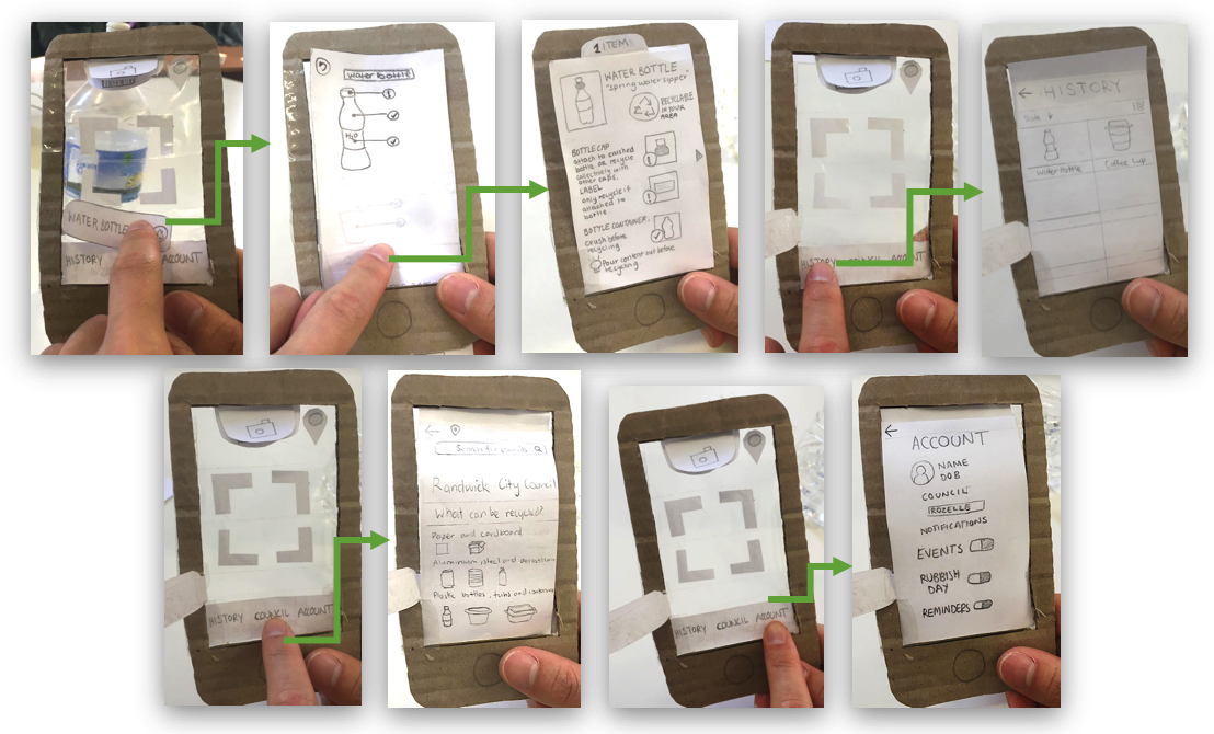
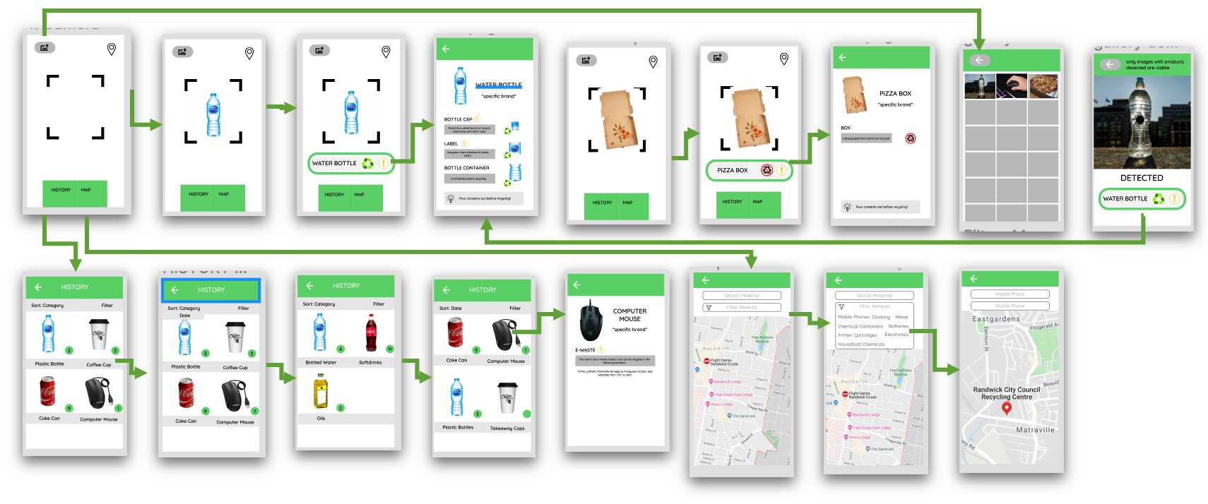
We start this process by each member creating their own interpretation of how our final concept application will be implemented. We each created 3 different Wireframes and Wireflow diagrams sketches, based on our User Goals and chosen Persona. We then internally critiqued each version, providing feedback and collating the aspects of each design that we felt were necessary, yielding a collective wireflow. This process was repeated twice in order to advance to creating our paper prototype which would be further tested.
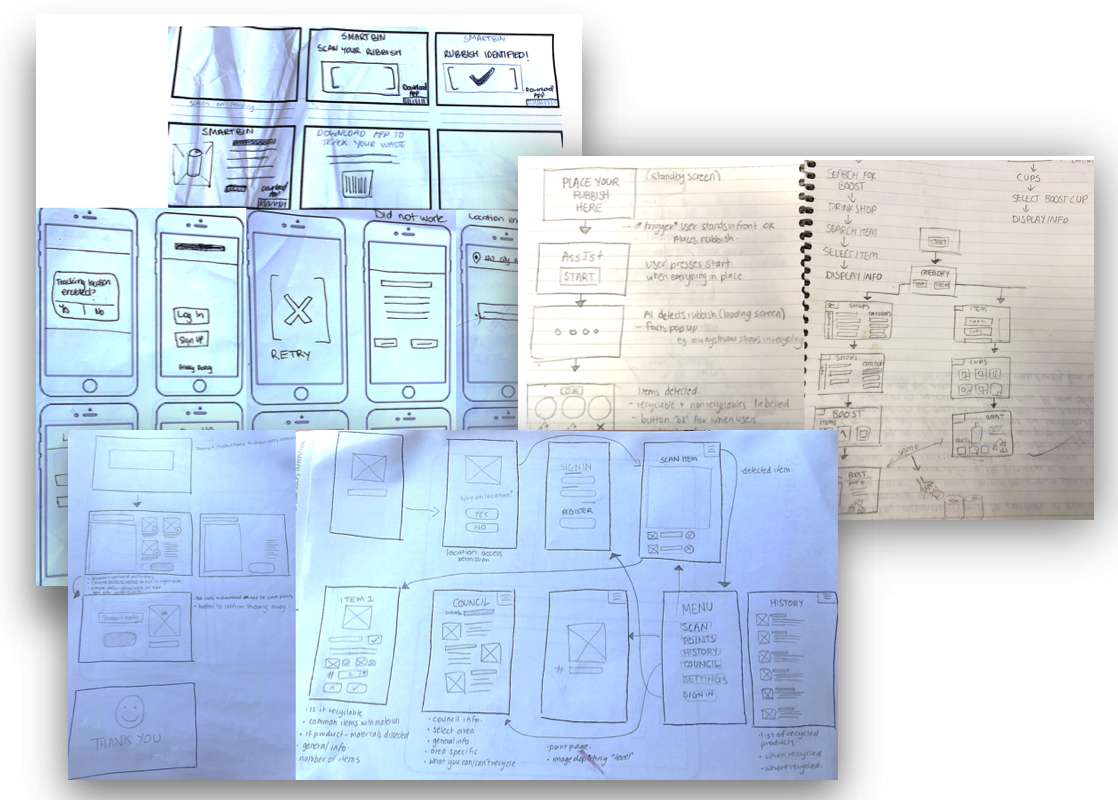
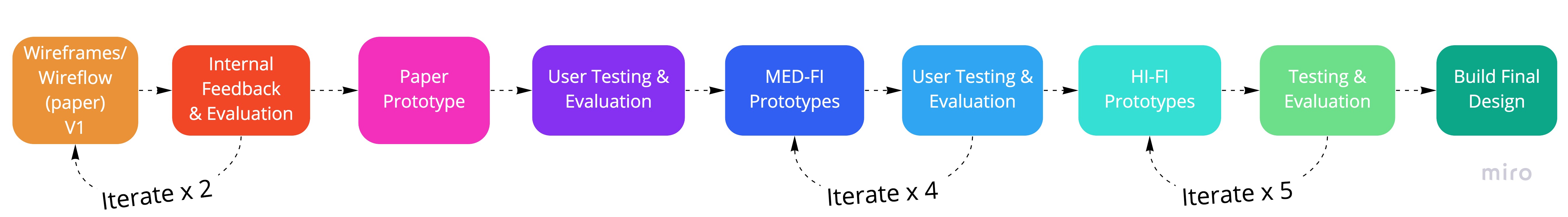
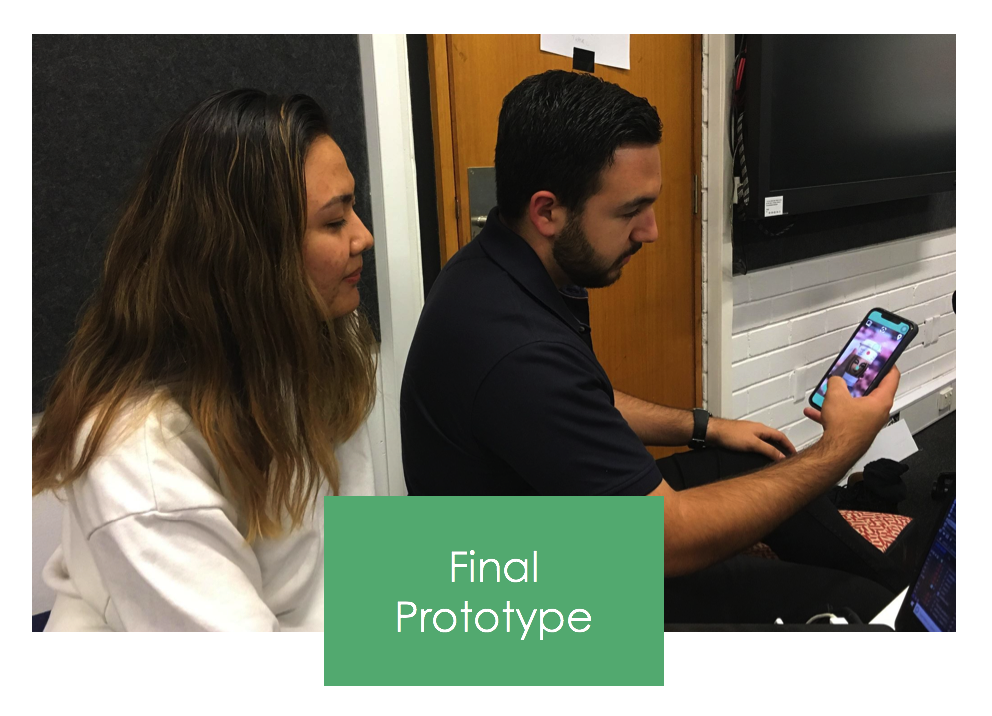
Reccy Design and User Testing Process
As recommended by Hinderer Sova and Nielsen (2012) user testing was done on with users similar to our persona, to ensure that the users being tested were relevant to our design brief. We chose to perform the think aloud because we wanted to know the user’s thought process when using the prototype. Nielsen (2012) states that think aloud testing can serve as a window to the soul. Following the advice of Nielsen (2014), for the think aloud, we showed users a 1 minute demo video before conducting the think aloud so that they could provide more useful information.
Reflection
After creating our Paper Prototype we tested 4 participants using our initial 10 Concrete Tasks and User Goals. We performed structured Think-Aloud tests with focus on understanding how the users will operate our application and whether they are able to easily navigate their way through the Concrete Tasks. After each Think-Aloud we performed a short Interview, enquiring what they thought was confusing and why. All users were able to complete all the tasks, however, the completion of the tasks took longer than expected and users required help at some stages. Users struggled with tasks relating to the council information and the presentation of information relating to the rubbish. “This could be bigger” - The user indicated that the information screen was difficult to read because of the small size ““Use red and green to know straight away” - The user suggested the use of colour to help recognition ““Drop the caption thing, hover over the water bottle, like google lens” - The user suggested a simple user interface pattern like the google lens app As a result of this round of testing we discovered that our overall wireflow was too complex and we needed to re-structure our Wireflow and remove pages from our Wireframes.
Key Takeaways
- Remove unnessary pages - Friends/World, Awards, My Goals
- Simplify the overall process - All users should be able to use the app with or without an account.
- Improve the interface layout to reflect modern mobile interfaces.
Reflection
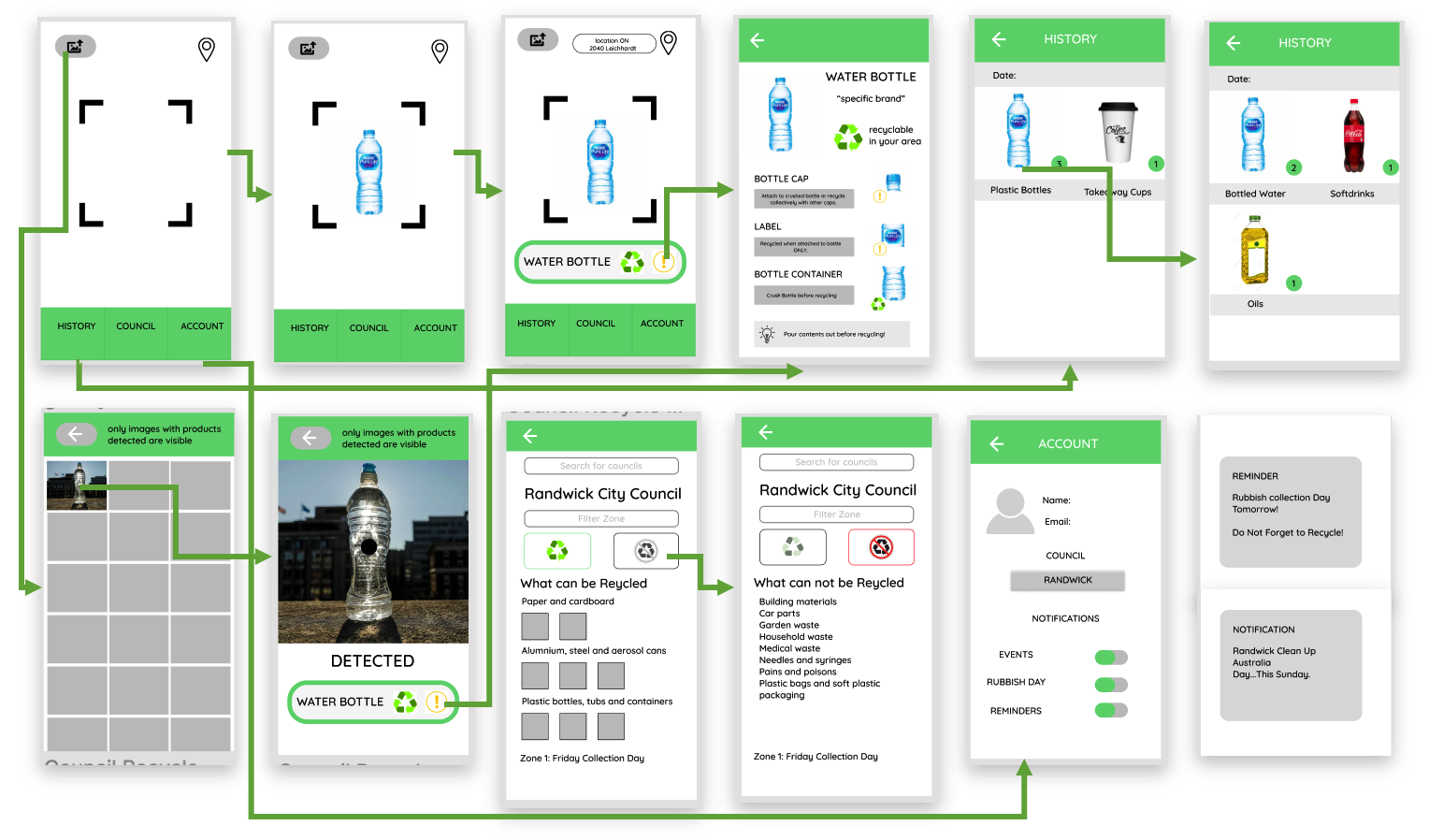
Our next round of User Testing we implemented our paper prototype into a digital medium fidelity prototype using Figma. We were comfortable moving to medium fidelity prototyping as we were happy with how people responded to the paper prototype but thought it was limited and lacking important interactions. We performed another set of Think-Aloud tests using the previous User Goals and their associated concrete tasks. Using this data we created a summarised table for all users based on each task. The main objective of this round of testing was to see how the users performed against our set tasks and to get further understanding of how the User interacts with the Application when its in digital format, in order for us to provide the users with the most important and relevant information.
Key Takeaways
- Remove the Council aspect of the app.
- Remove the user account page.
- Incorporate a Map feature for locating where they can recycle certain materials
Reflection
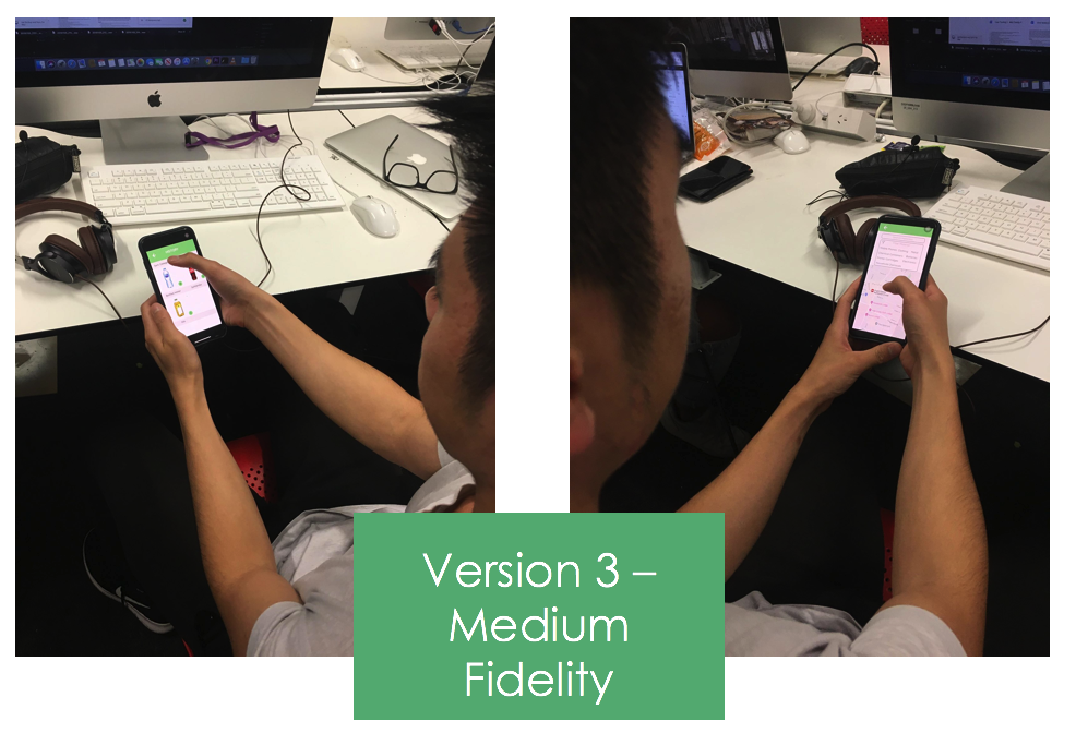
Taking onboard the feedback from our previous think-alouds and the feedback from our tutor mentor, we stripped back the wireflow and removed all council related features and instead implemented a map that will show users where they can recycle specific waste e.g E-waste which you would not be abled to recycle in the normal recycling bins. We formed new user goals and concrete tasks that we would use to test. At this stage users who were familiar with our previous prototypes were able to navigate through the new interface and complete the new concrete tasks. Overall they were interested to see the map feature and thought it was much better use of the application rather than council information. The execution of the scanned product information page was confusing for majority of the users and was evident that the information was not being simply displayed.
Key Takeaways
- Remove the breakdown of the product on the information page, as it was too cluttered and users were distracted.
- Only provide the user the option to locate common materials that require specific waste management rather than the ability to search for a material.
Reflection
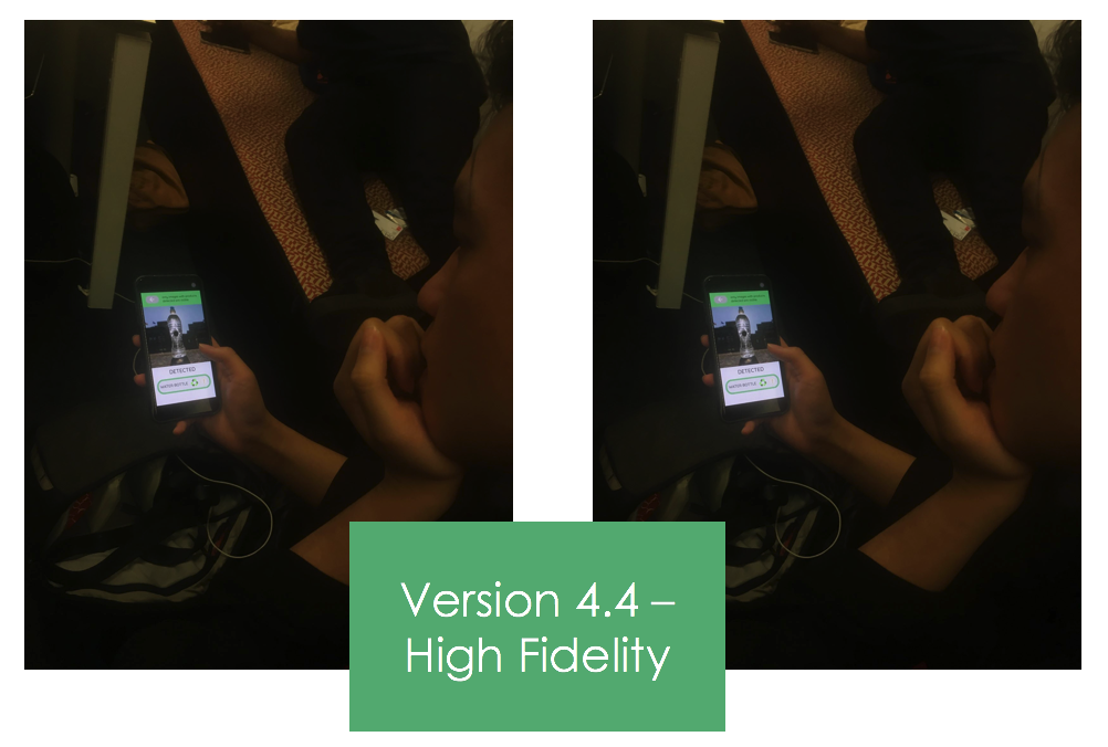
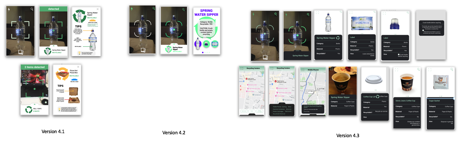
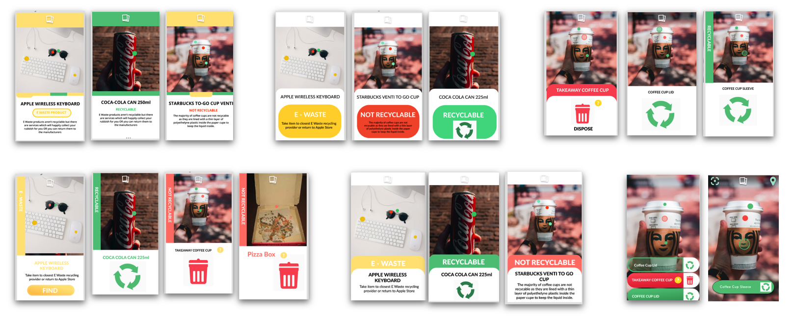
At this stage in our design process we moved from Medium Fidelity to High Fidelity. We started this process by creating different designs for the information page which are displayed above. After feedback from our tutor mentor, it was evident that we were not representing the information visually in a modern and cohesive way. We then begun to get inspiration from similar designs and making different colour schemes.
We then did A/B testing on different colour schemes. These tests were successful in determining which of those colour schemes users responded to, although pointless as most users commented on how they wanted a stand out colours like green and red for items that were Recyclable verse not Recyclable.
Users also commented on some information points such as ‘category’ and ‘material’ being unnecessary and were not required.
Key Takeaways
- Strip back the information on the detected information page.
- Incorporate red and green colour scheme to reflect the standardised waste management colours.
Reflection
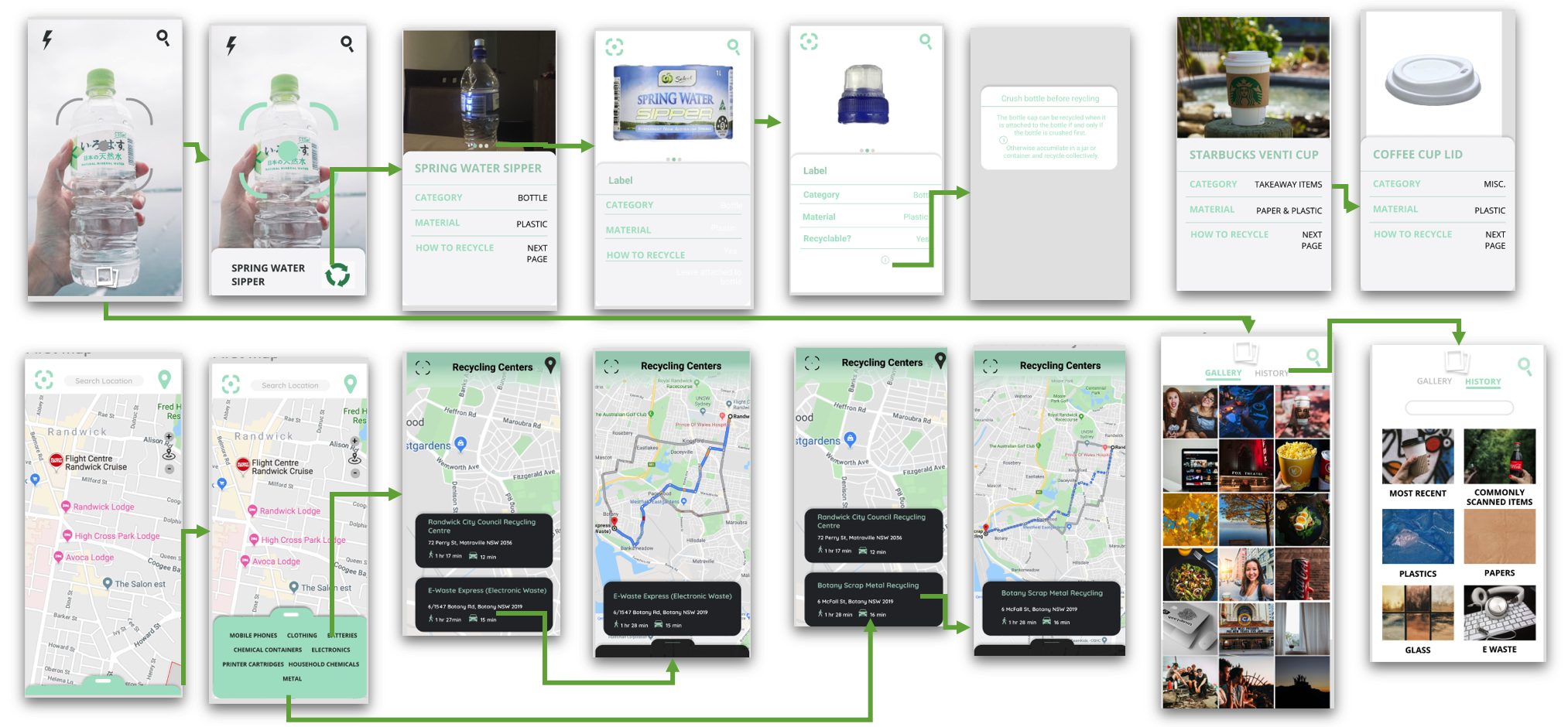
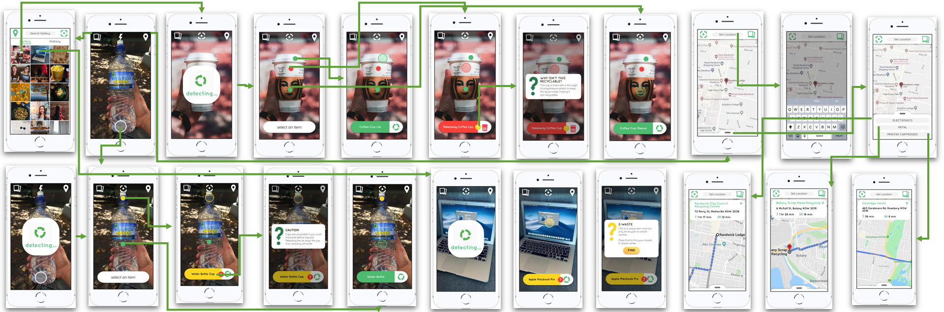
Our final design interface was developed initially by completing rapid design implementations, which are displayed above. Our focus at this stage was to lock in the information page and how we could display a minimum amount of information but still aid the user when recycling. We performed A/B on the above implementations with users responding: “Text is slightly too overbearing even though the colours are clear to understand” – User commenting on the first iteration with the tabs. “I like the block of colours, it is easy to understand the purpose of each colour” – User liked the colours and how that represents the visual implications of information without reading the text “ oooh, the gif makes things look more alive. And it’s pretty easy to understand without any sort of text” – Excess text is unnecessary for effective outcome. “what is this small button for? Oh it tells me why the coffee cup isn’t recyclable” – Clean interface helps User voluntarily open information to learn more about product. Nielsen’s 10 Heuristics were used to quickly and preemptively evaluate the user experience for the final prototype (Nielsen, 1994). The Reccy app interface prioritises heuristics such as ‘aesthetic and minimalist design’, ‘consistency and standards’ and ‘visibility of system status’. The app follows a strict criteria for aesthetic design, specific terminology, and available functions throughout the system. The navigation bar, present in all screens, uses the same layout and icons throughout the app. However its weaknesses lie in ‘user control and freedom’, helping users ‘recognize, diagnose, and recover from errors’ - the app does not account for user errors e.g. if an image is taken incorrectly and the app cannot recognise the rubbish. “I didn’t know that the coffee cup wasn’t recyclable. The buttons are pretty easy to understand and interpret the information given” – Users are quickly understanding how to use the interface and how to read the information. “the icon is really nice and the information is really helpful” – Users comments became more positive throughout the entire app process. “ oooh, the gif makes things look more alive. And it’s pretty easy to understand without any sort of text” – Excess text is unnecessary for effective outcome. “I like the apps simplicity” – Users have gone through testing quicker and with ease du to final design and prototype..
Key Takeaways
Walkthrough
Figma Prototype
Next Steps
The next steps for our Application would be to implement our design into other screen interfaces. We had inital plans to implement a screen on top of bins in popular public spaces which would use the same interface as the app. The screen would be localised and act as an on boarding system for the App and will also enable users without smart devices to access our technology. With more time put in development we would be able to further transform our design. We hope you enjoy Reccy.
References
Nielsen, J. (1994). 10 Heuristics for User Interface Design. Retrieved from https://www.nngroup.com/articles/ten-usability-heuristics/ The Psychology Behind Why People Don't Recycle. (2019). Retrieved 11 September 2019, from https://www.huffingtonpost.com.au/entry/psychology-of-why-people-dont-recycle_n_57697a7be4b087b70be605b3 Your Recycling Gets Recycled, Right? Maybe, or Maybe Not. (2019). Retrieved 10 September 2019, from https://www.nytimes.com/2018/05/29/climate/recycling-landfills-plastic-papers.html